Velia Lala did the boldest thing. At sixty she sold a four-thousand square foot home, moved into a luxury RV with her service dog Lexie, and pointed her life somewhere new. She had already reinvented herself more than once. Award-winning artist. Solo traveler. Travel advisor. What she did not have was one identity to hold all of it. So I built the brand and the system behind it, the content engine that runs the feed and the website it all lives on.
The main logo already had the part worth keeping. The illustration of her and Lexie, the compass behind them. I kept that icon and rebuilt the rest around it, starting with a new font that actually reads like her.
Then I created the Lady V wordmark. Her name in a hand of its own, close to her real handwriting, for the covers, the merch, and the sign-off at the bottom of every note.
Then the icons. Custom-built in the same gold line, one for each corner of her world. The compass, the plane, the RV, the key, the envelope, the suitcase. They carry her Instagram highlights and her site, so the first thing a new visitor sees already reads as one brand.
Colour and type she can hand to anyone. Any designer, any assistant, any future teammate can open the guide and Lady V still looks like Lady V.
Royal jewels and gilded edges. Purple for wealth and reinvention, black for the editorial backbone every luxury brand needs, gold for the earned moment. Deep and saturated, with gold as the punctuation.
70 / 20 / 10. Seventy percent noir and aubergine, twenty percent plum and royal, ten percent gold and bone. Gold is not decoration. Used everywhere, it loses meaning. Used precisely, it makes everything feel earned.
Pulled straight from the DNA already in her logo. Cinzel for ceremony, Cormorant for soul, Inter for breathing room. Three fonts, never more.
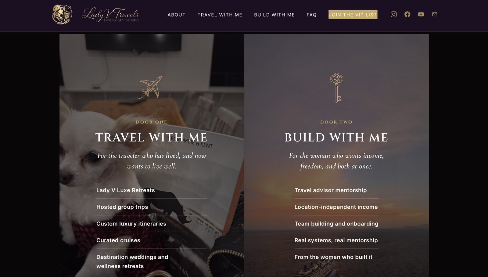
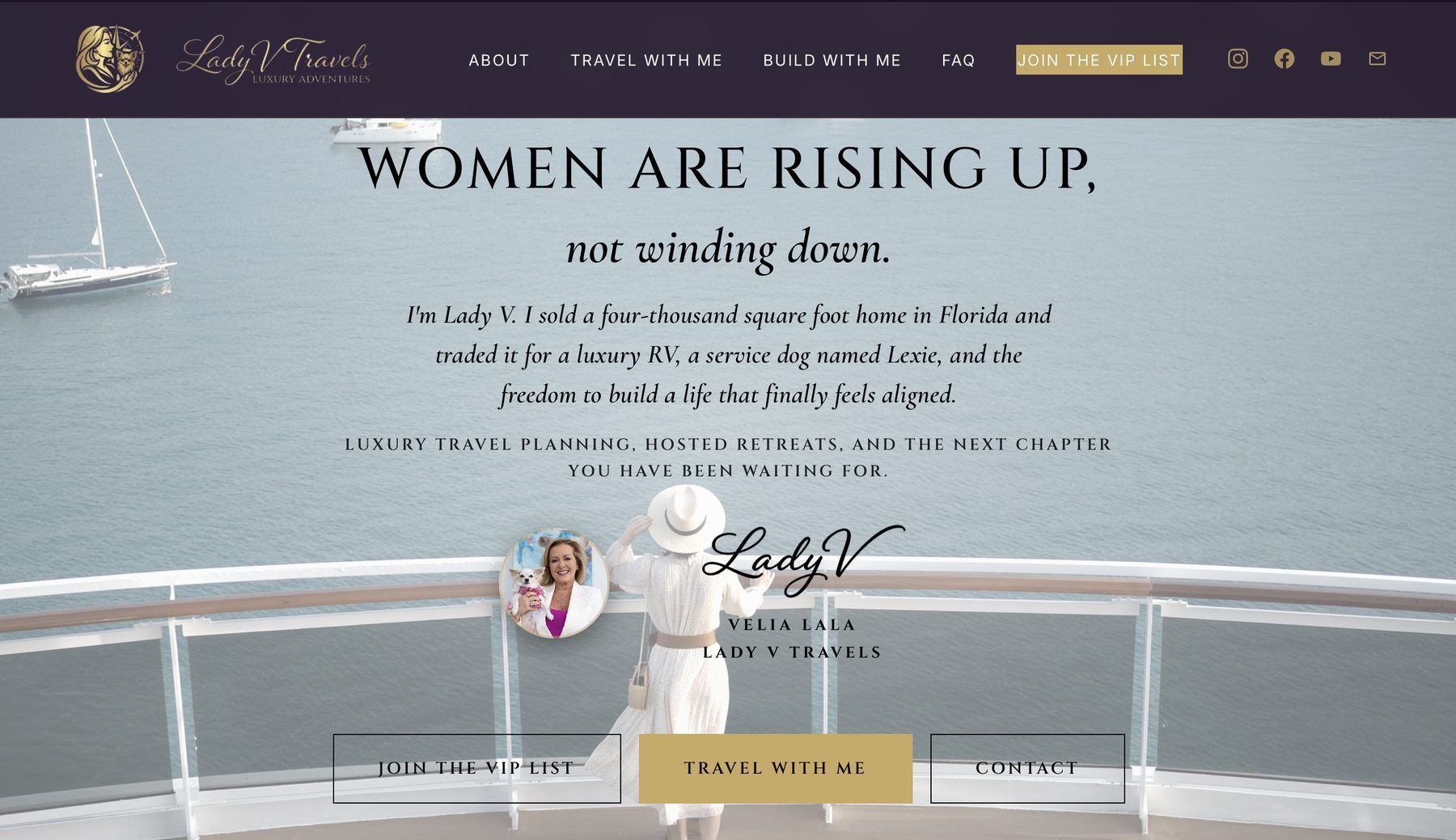
See it in action on the site
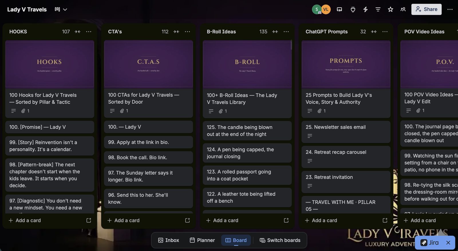
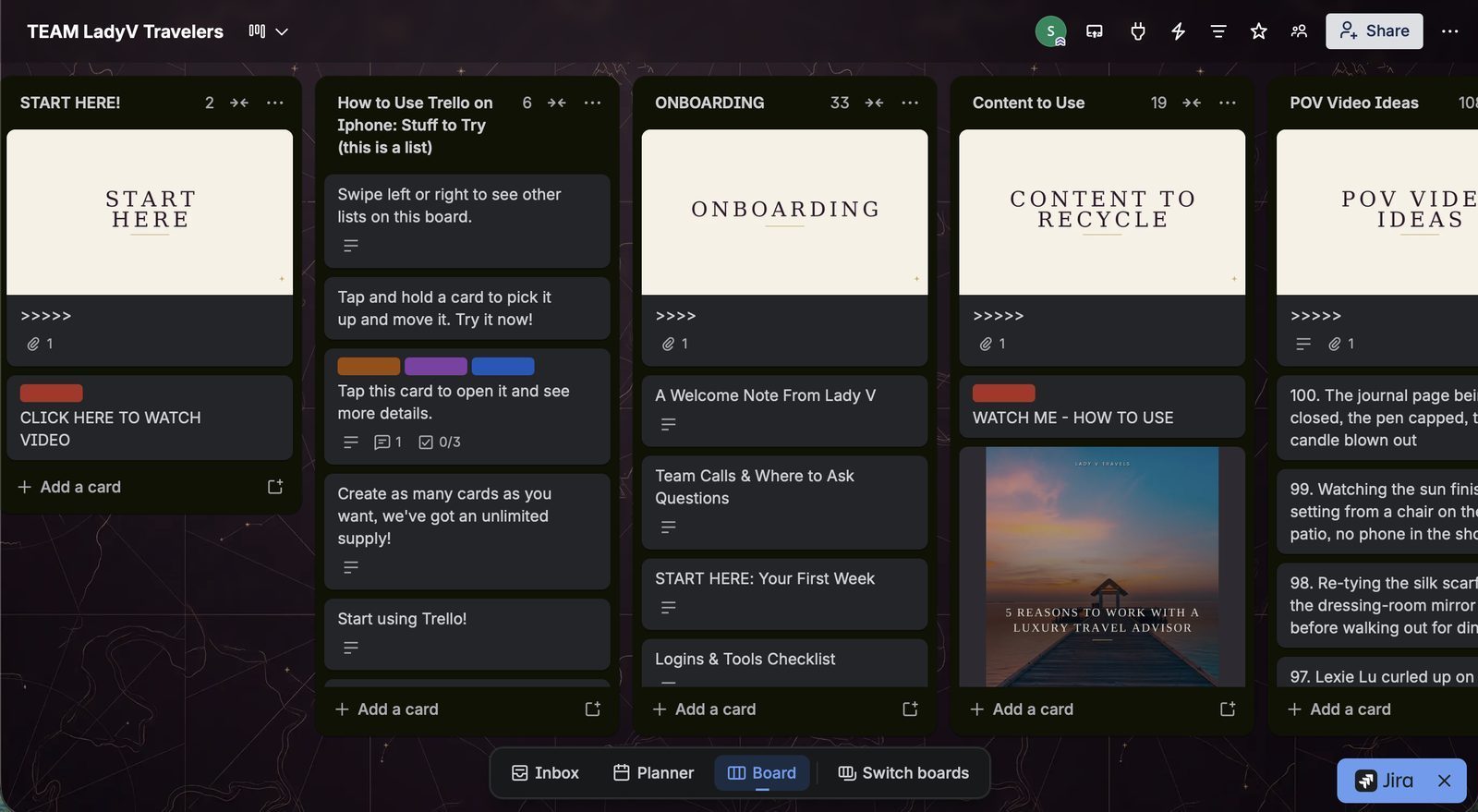
A logo does not grow a business. A system does. So the real deliverable was the engine behind the feed. Two Trello boards, built and loaded. One runs her personal content. One runs her team of travel advisors. Both give the work a home, so it keeps moving whether or not I am in the room.
This is the part that lasts. A business that runs with her life, not against it.
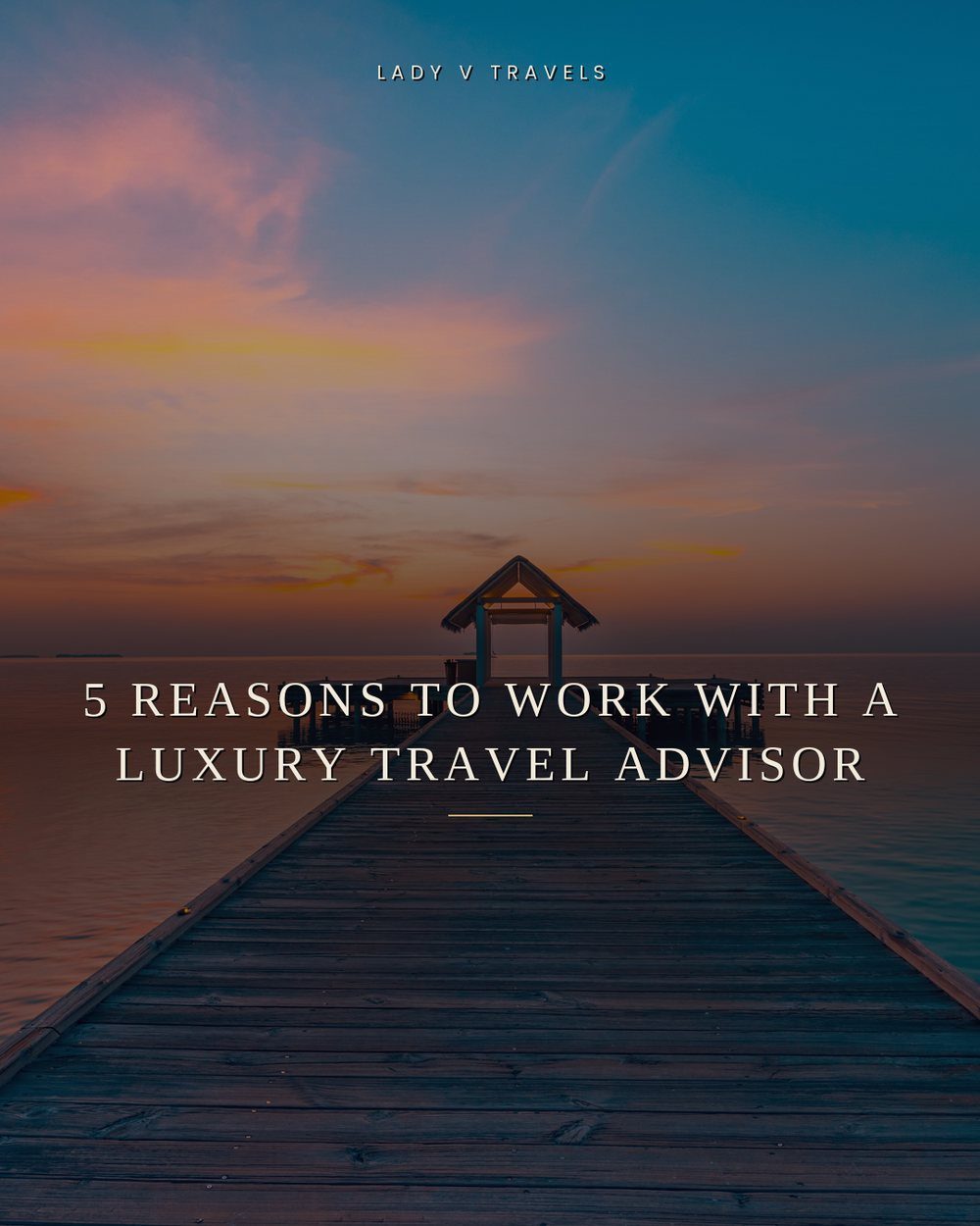
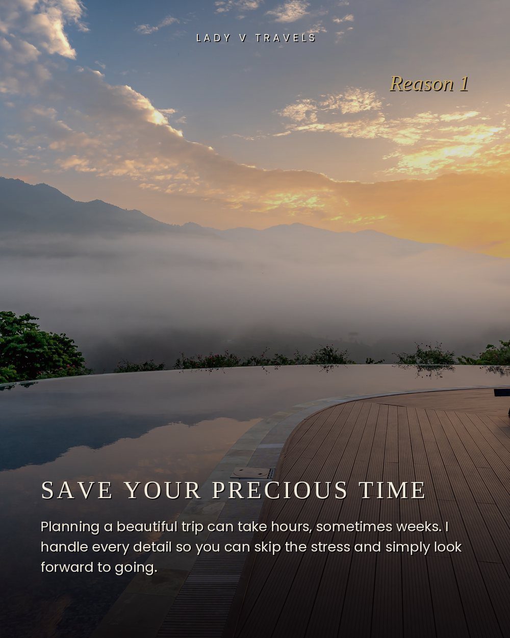
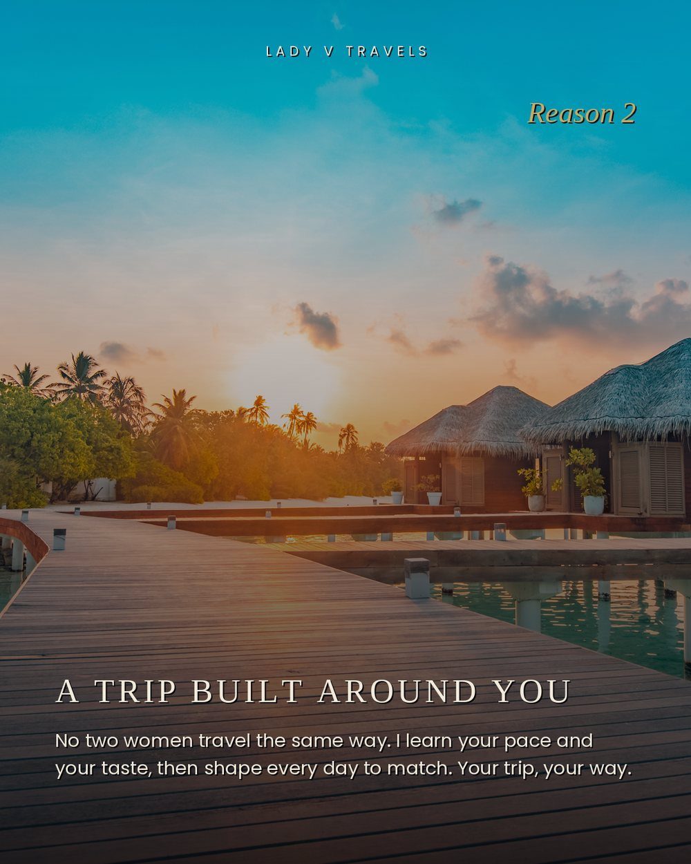
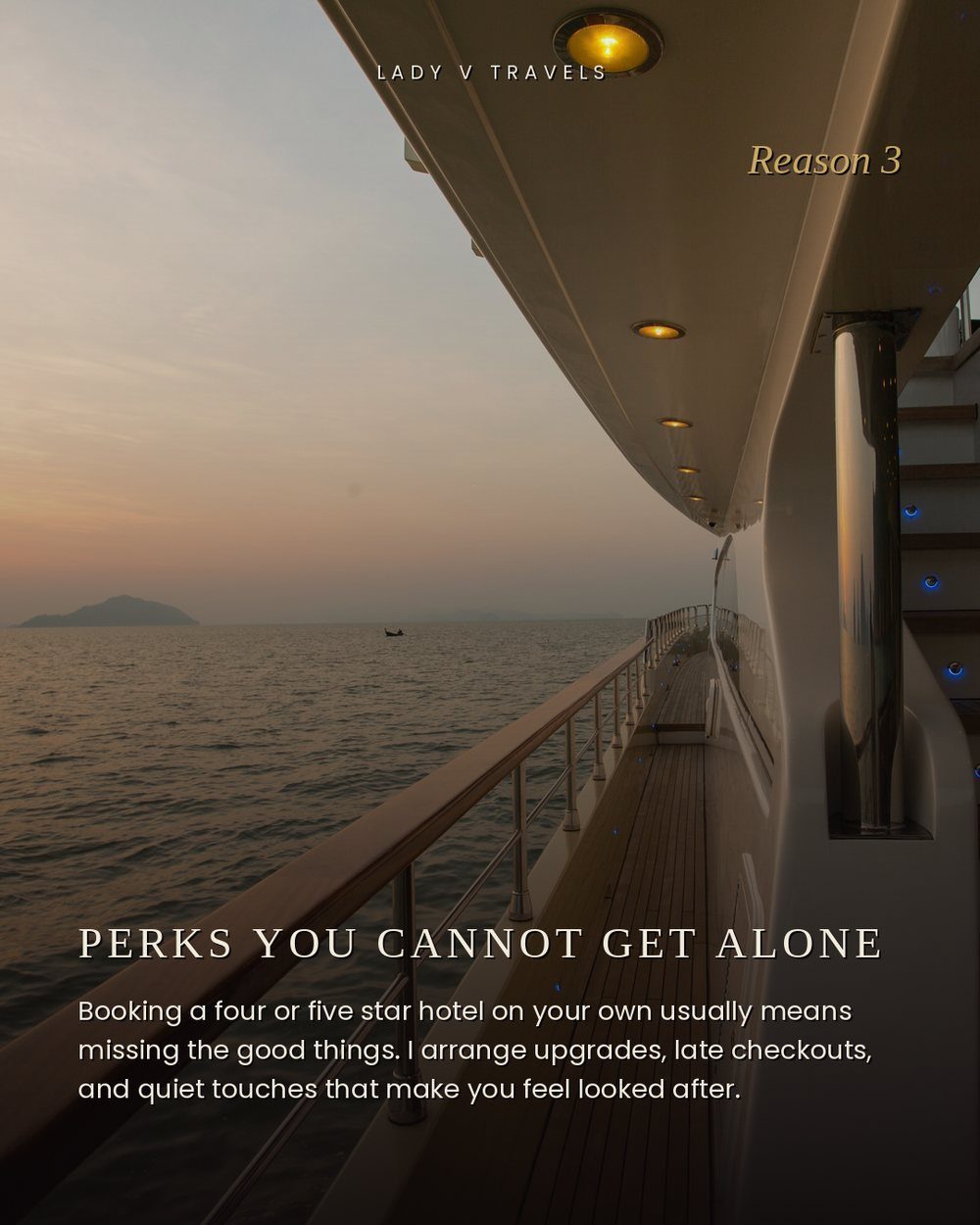
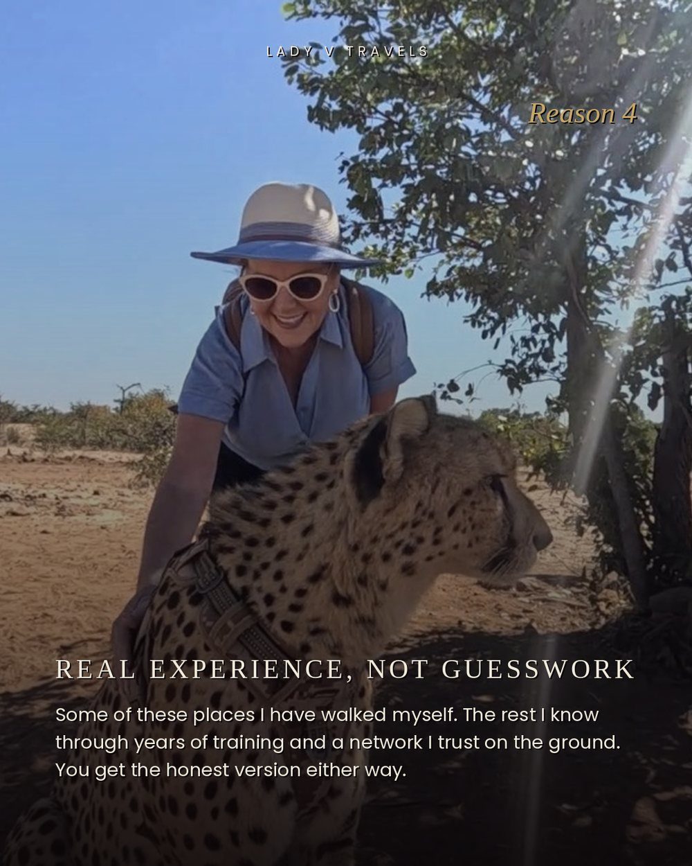
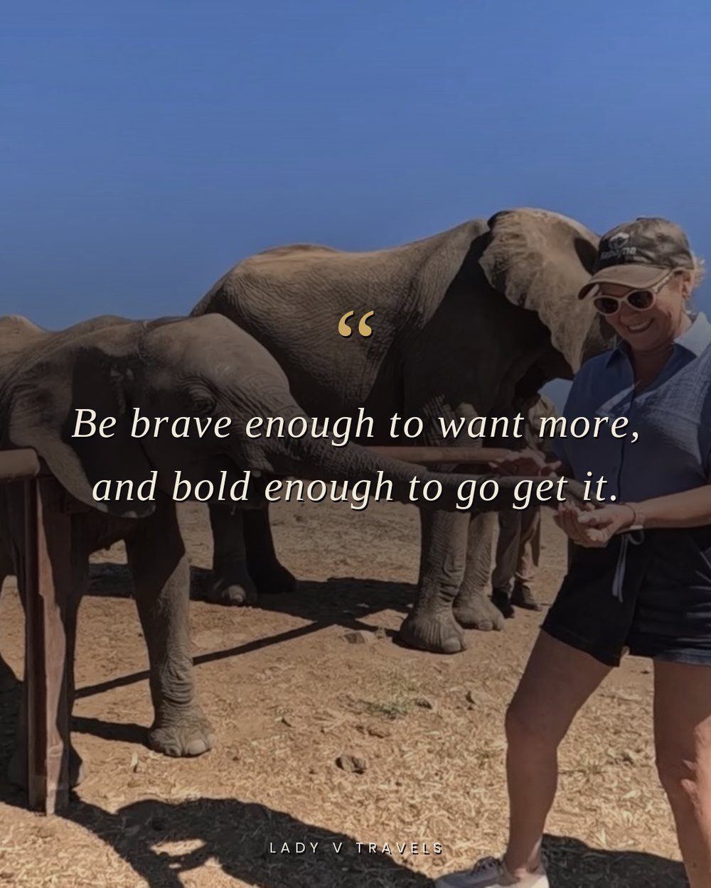
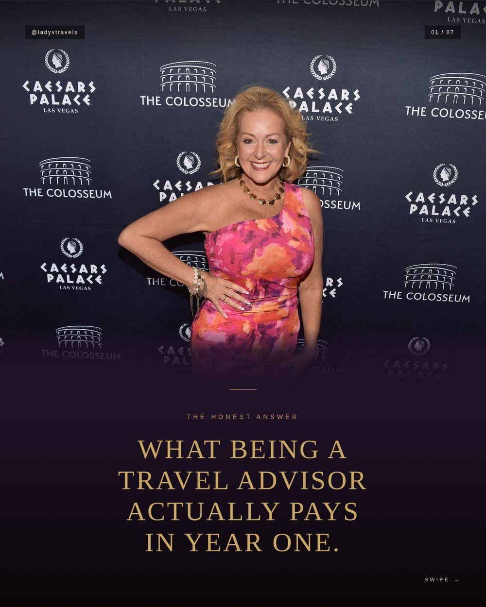
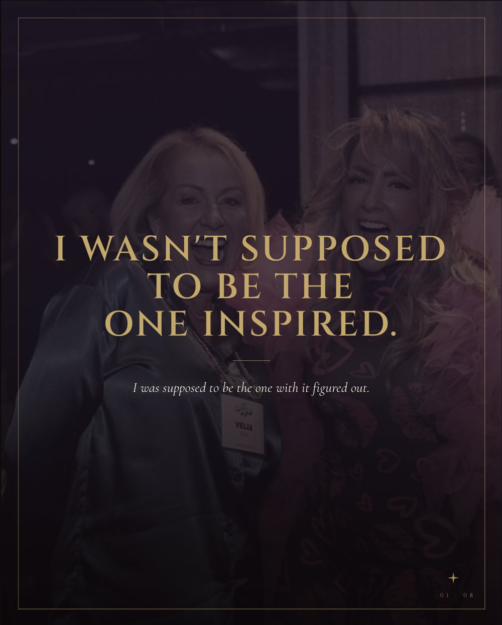
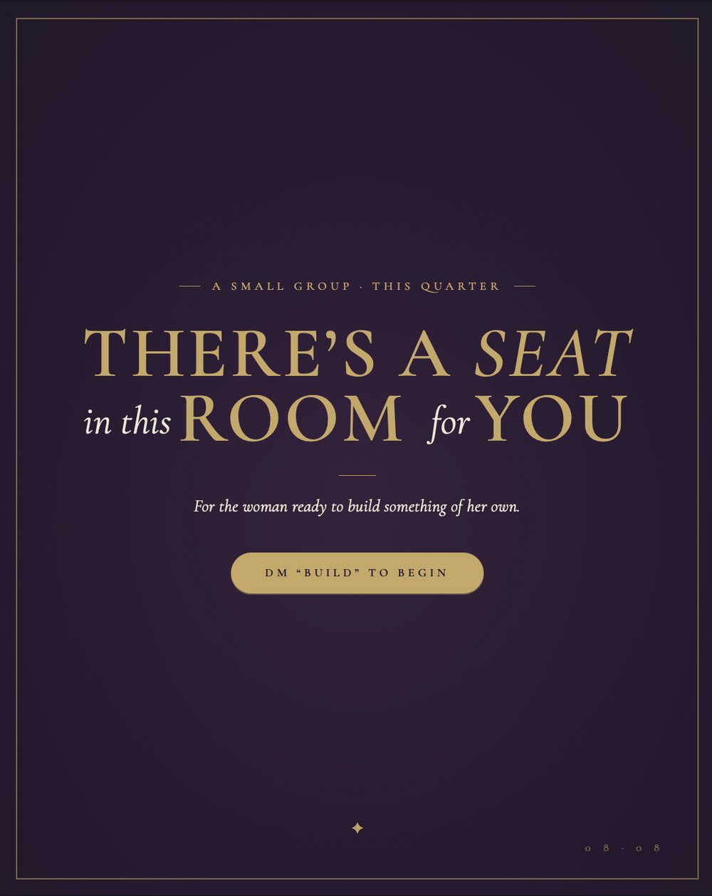
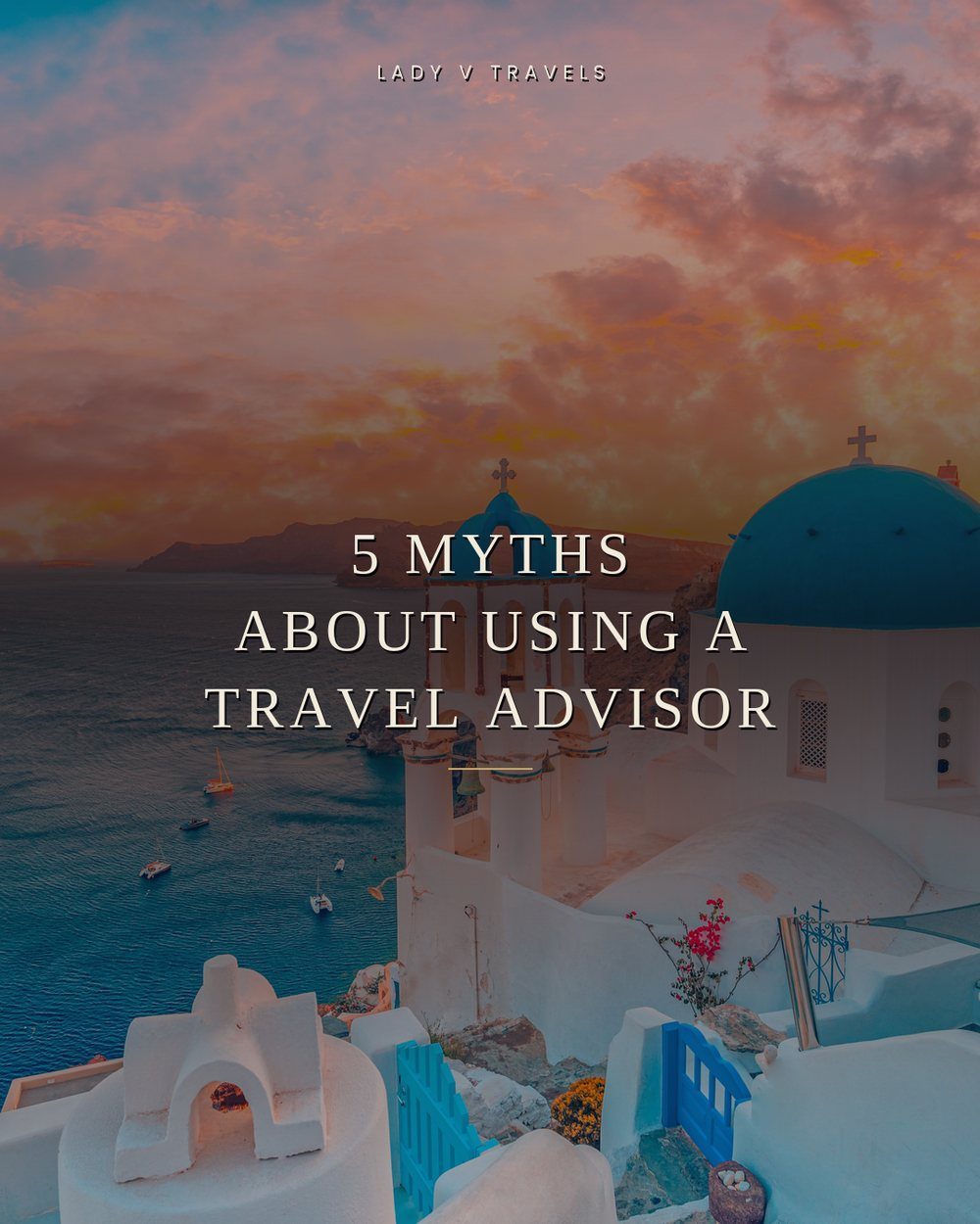
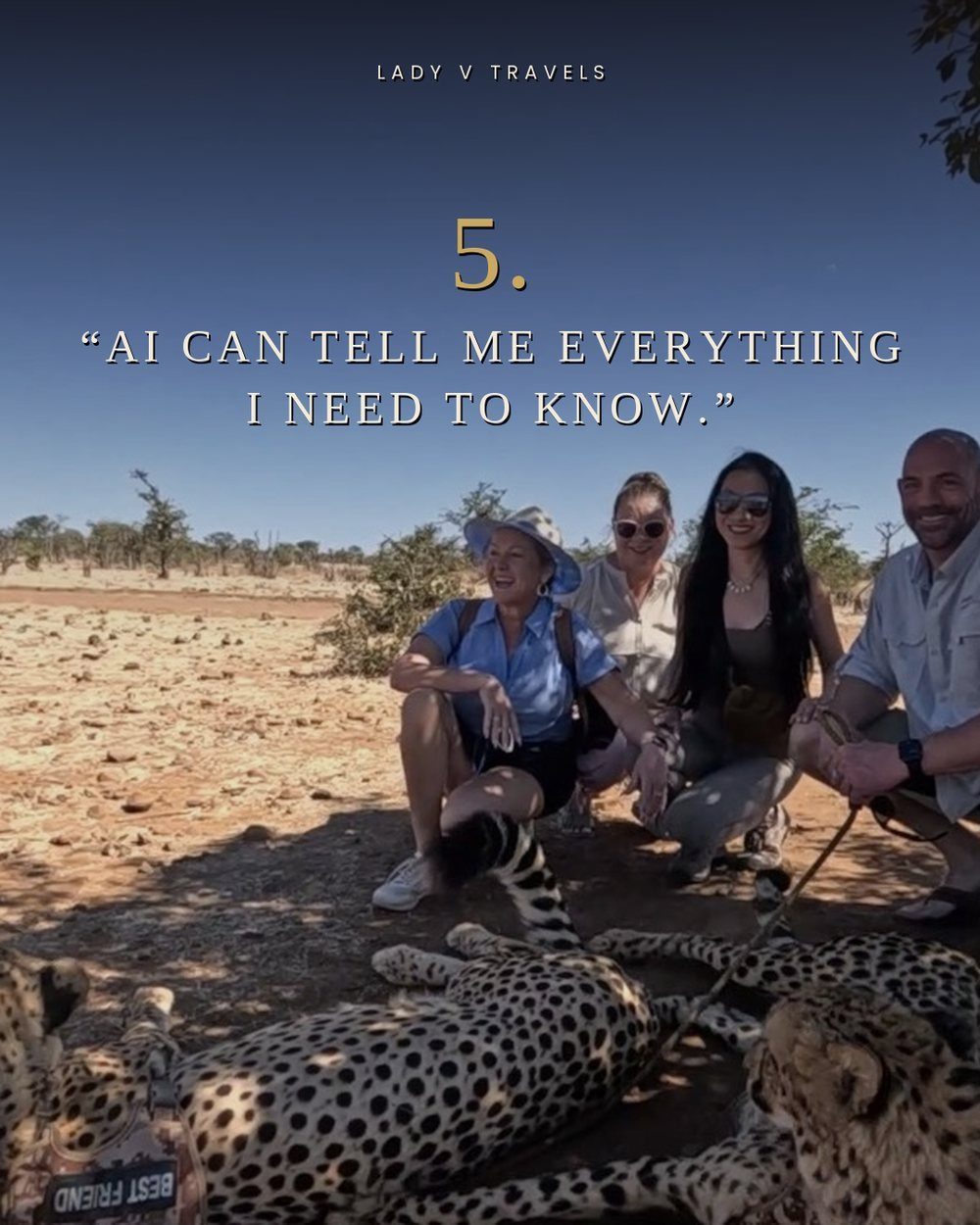
Carousels, quote posts, reels, and covers, all built on her brand identity, the same palette and type every time. The strategy stays invisible until it shows up in the feed looking like one person made all of it. This is what that looks like.